Guide
Wedding Font Pairings for Invitations
Good invitation typography is mostly restraint: two fonts, one clear job for each. These seven pairings use free Google Fonts, so you can use them in a card editor, a design app or a printed invitation.
Updated 2026-11-02
Four rules before you pick
- Use two fonts, three at most. One for names and headings, one for details.
- Keep script fonts for names only. Dates, times and addresses should be in a plain serif or sans so they are easy to read.
- Pair contrast with contrast: a decorative or high-contrast font with a calm, simple one.
- Test the date and address at the smallest size guests will see, especially on a phone screen.
Seven pairings
Each name below is available from Google Fonts. Open the font page to preview your own names before you decide.
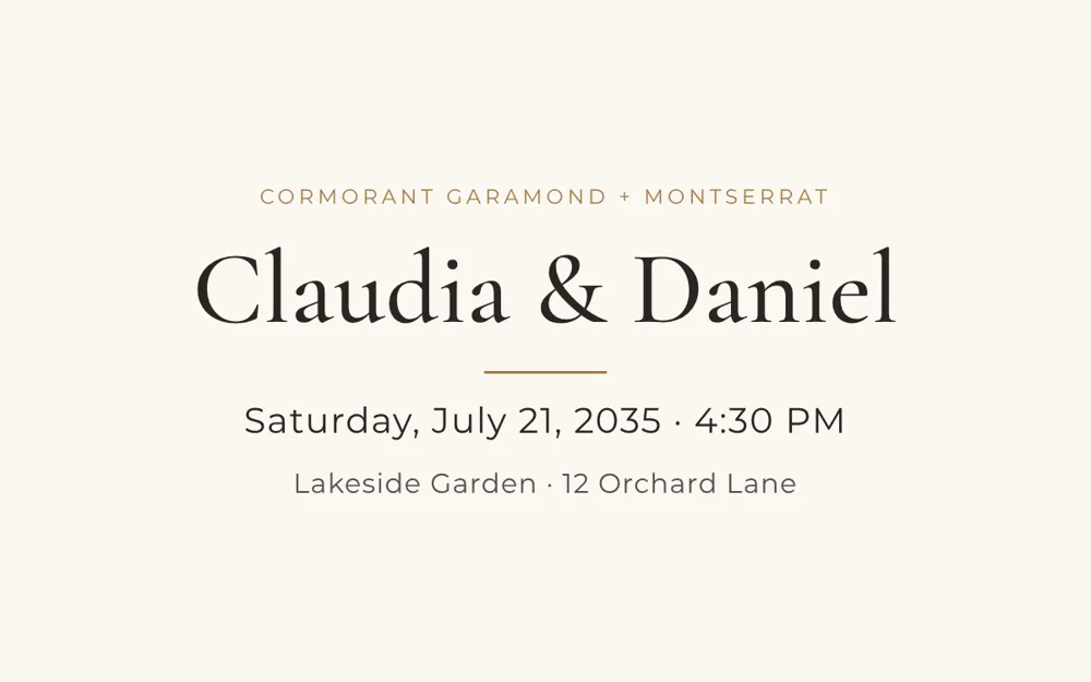
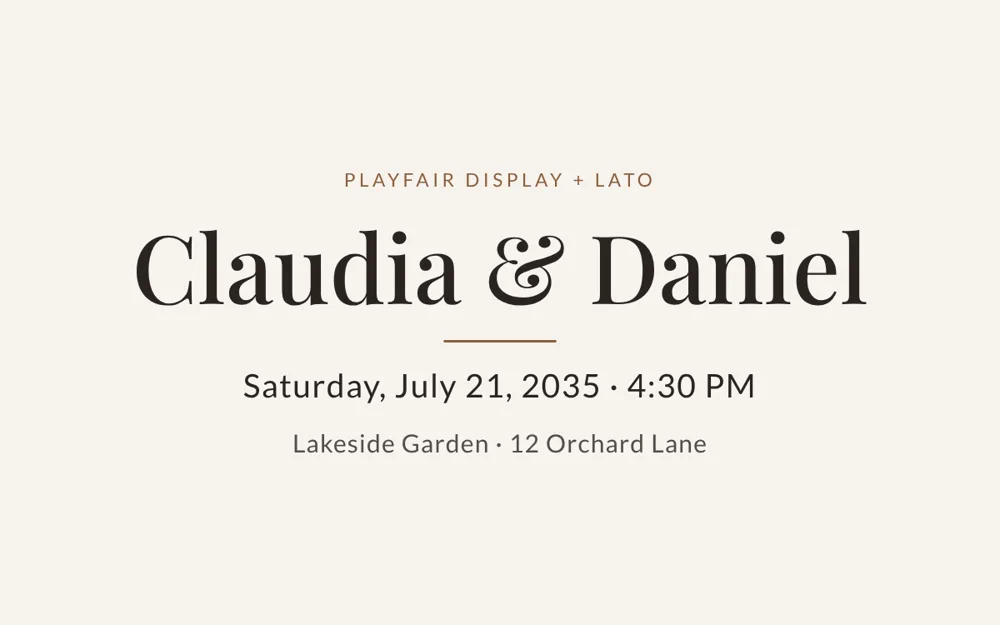
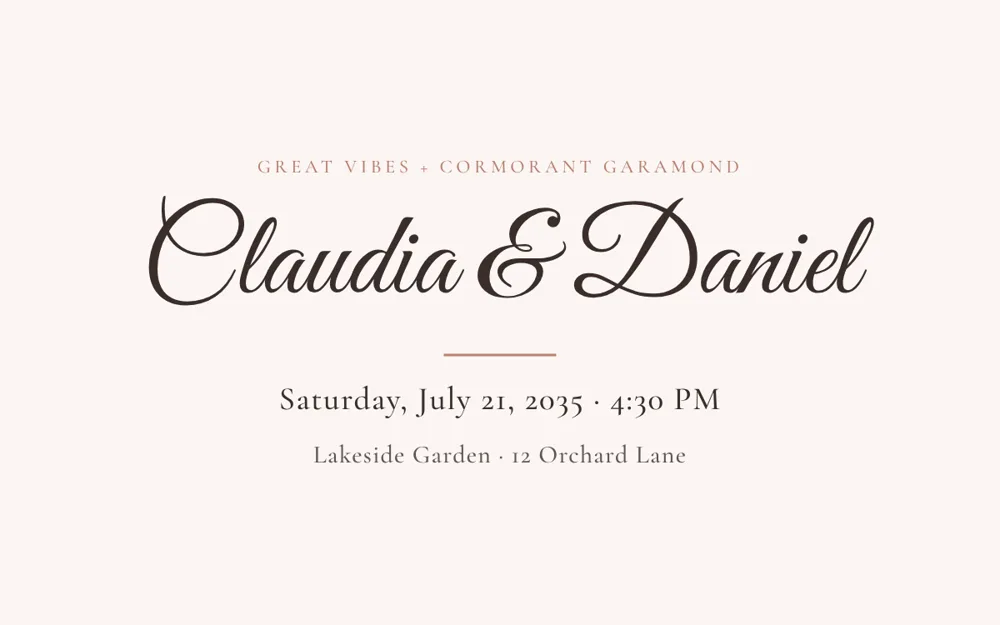
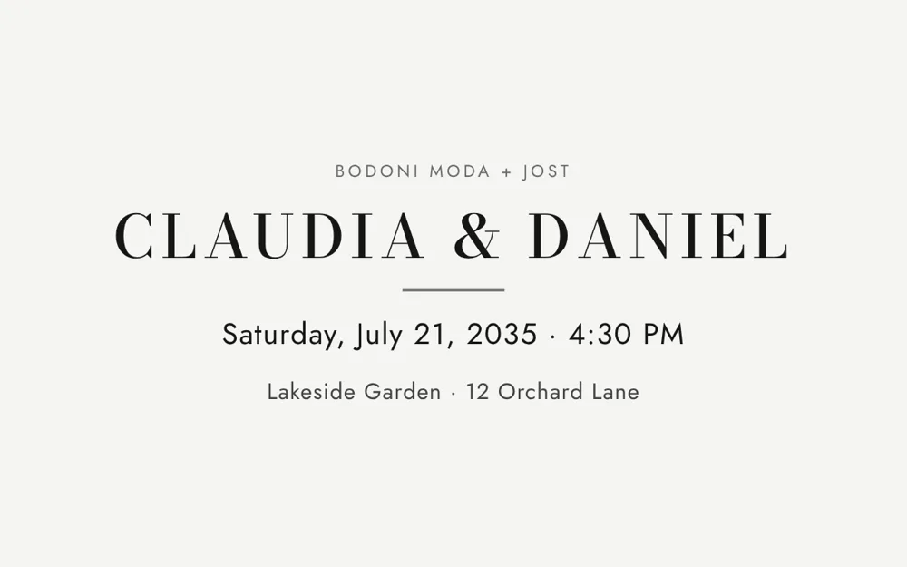
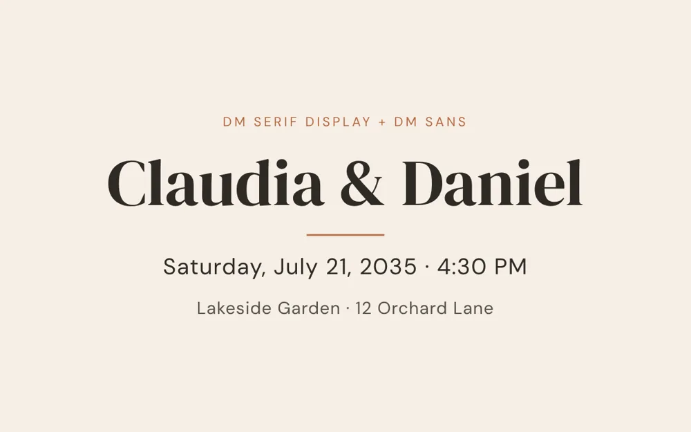
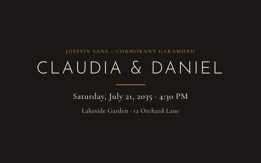
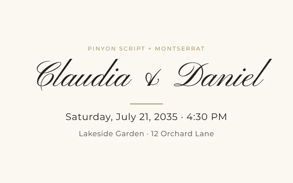
| Names and headings | Details and body | Best for |
|---|---|---|
| Cormorant Garamond | Montserrat | Classic and elegant; the safest all-round choice |
| Playfair Display | Lato | Traditional with a modern edge; formal evenings |
| Great Vibes (script) | Cormorant Garamond | Romantic script names with a refined serif for details |
| Bodoni Moda | Jost | Fashion and editorial looks; city weddings |
| DM Serif Display | DM Sans | Warm and modern; relaxed but polished |
| Josefin Sans (light, capitals) | Cormorant Garamond | Minimalist and art-deco styles |
| Pinyon Script | Montserrat | Formal calligraphy feel; ballroom and black-tie |
Sizing and readability
- On printed cards, keep body text around 9 to 11 points and make the names noticeably larger.
- In a video or on a phone, make the date and venue large, because viewers see them for a few seconds only.
- Use capital letters with extra letter spacing for short labels such as "Saturday" or "Reception", not for long sentences.
- Check contrast: pale text on a photo or pastel background is hard to read.
Licensing
Google Fonts are released under open licenses that allow personal and commercial use, including printing. Each font has its own page with the license, so check it if you plan to share or sell designs that include the font.
If you are making a video invitation
Video templates ship with fixed typography, so you do not need to choose fonts. You choose a style that already has a type treatment, then add your names, date and venue. If you are printing stationery as well, these pairings are a starting point for matching the look.
FAQ
What are good font pairings for wedding invitations?
A classic choice is Cormorant Garamond for names with Montserrat for details. Other reliable pairings are Playfair Display with Lato, and Great Vibes script names with Cormorant Garamond.
How many fonts should a wedding invitation use?
Two is ideal and three is the practical limit. Use one font for names and headings and one for the details.
Can I use a script font for the whole invitation?
It is better to use script for names only. Dates, times and addresses are harder to read in script, so set them in a simple serif or sans.
Are Google Fonts free for wedding invitations?
Yes, they are free and their open licenses allow printing and commercial use. Check the license on each font page if you plan to redistribute a design.